@ House of Data
Daily data visualisations on issues of politics, identity and inequality. Produced by me.
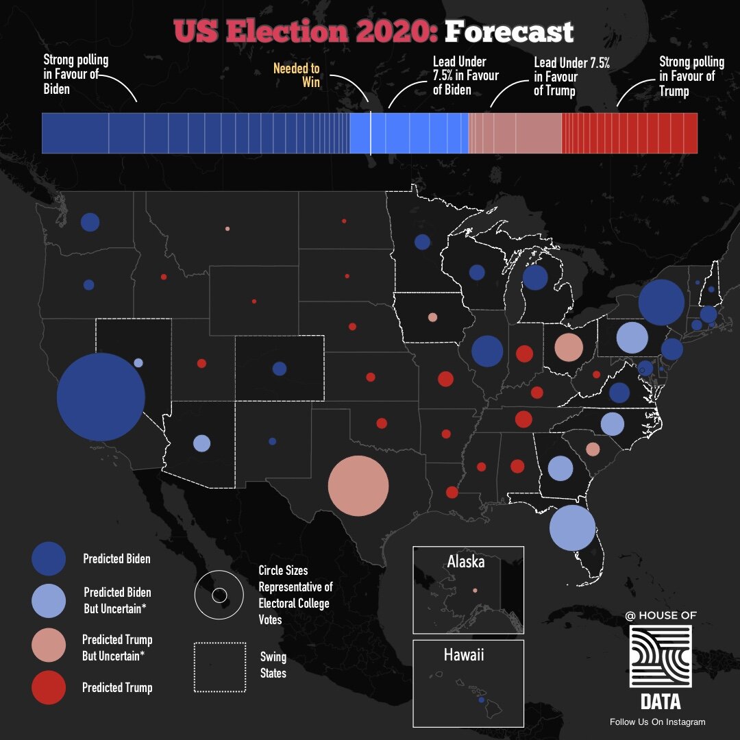
US Election Forecast based on FiveThirtyEight Polling Data
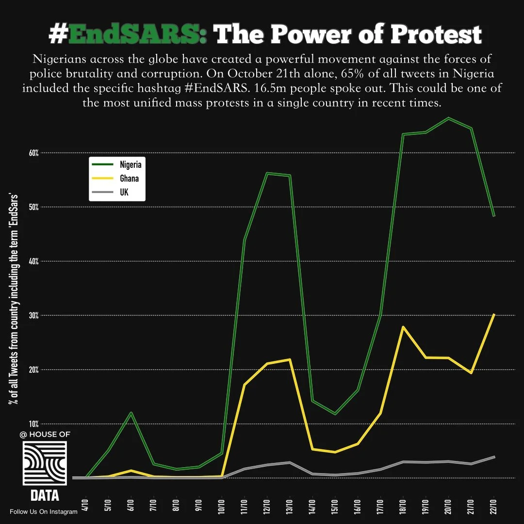
The chart above shows the proportion of Tweets in Nigeria which include the specific hashtag #EndSARS.
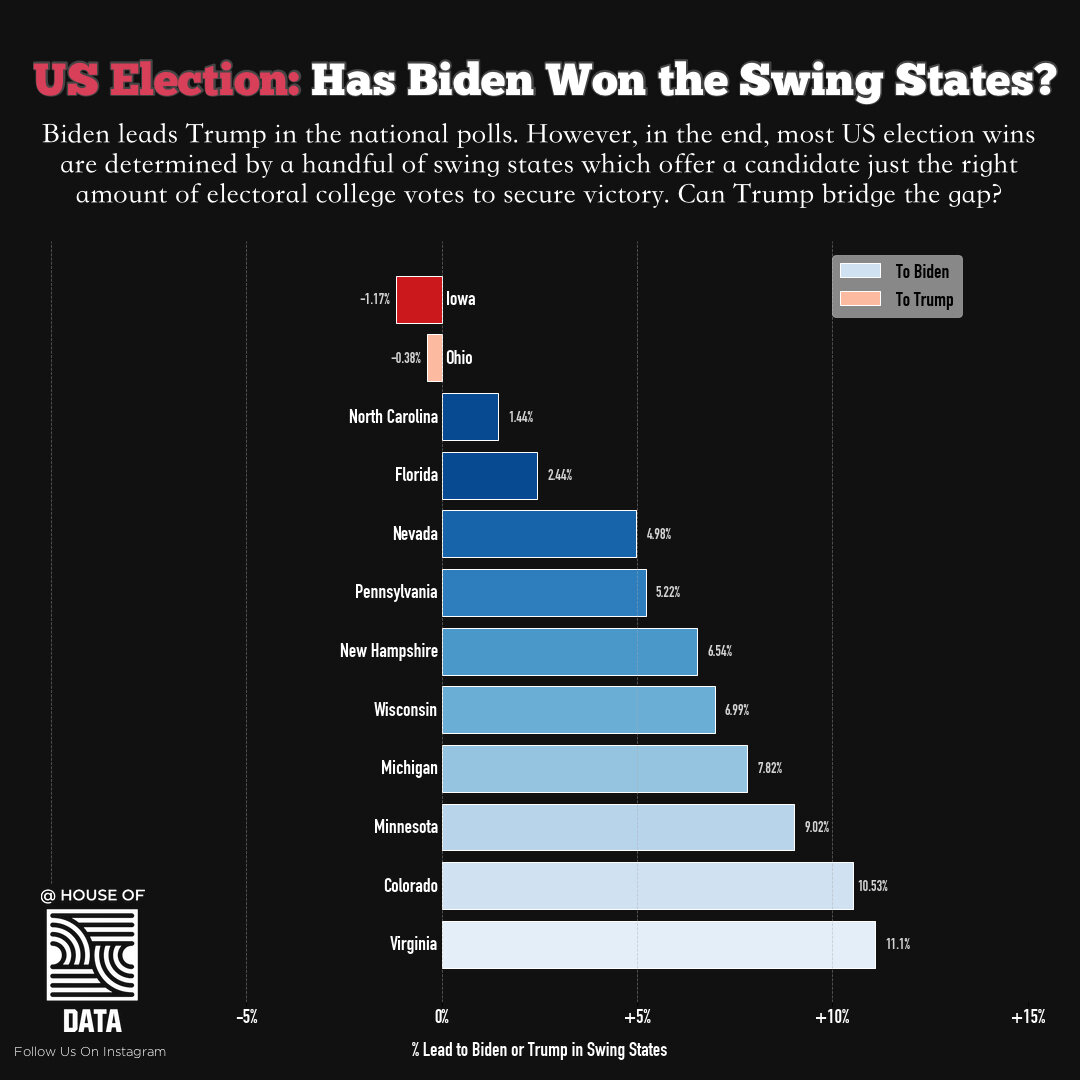
Biden leads Trump in the national polls. However, in the end, most US election wins are determined by a handful of swing states which offer a candidate just the right amount of electoral college votes to secure victory. Can Trump bridge the gap?
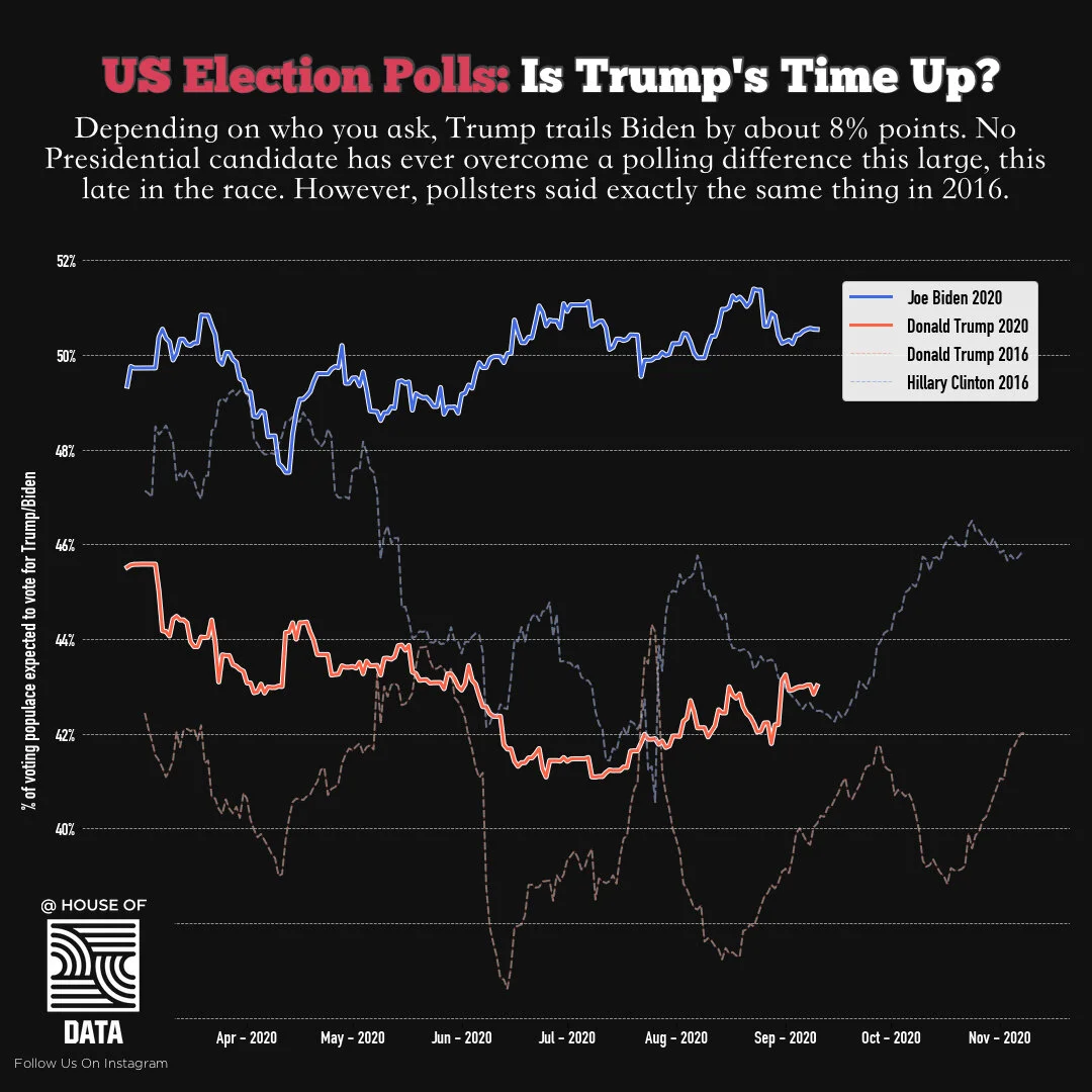
2020 vs 2016 US Election Polls. Could Donald Trump really win in November or is his time up?
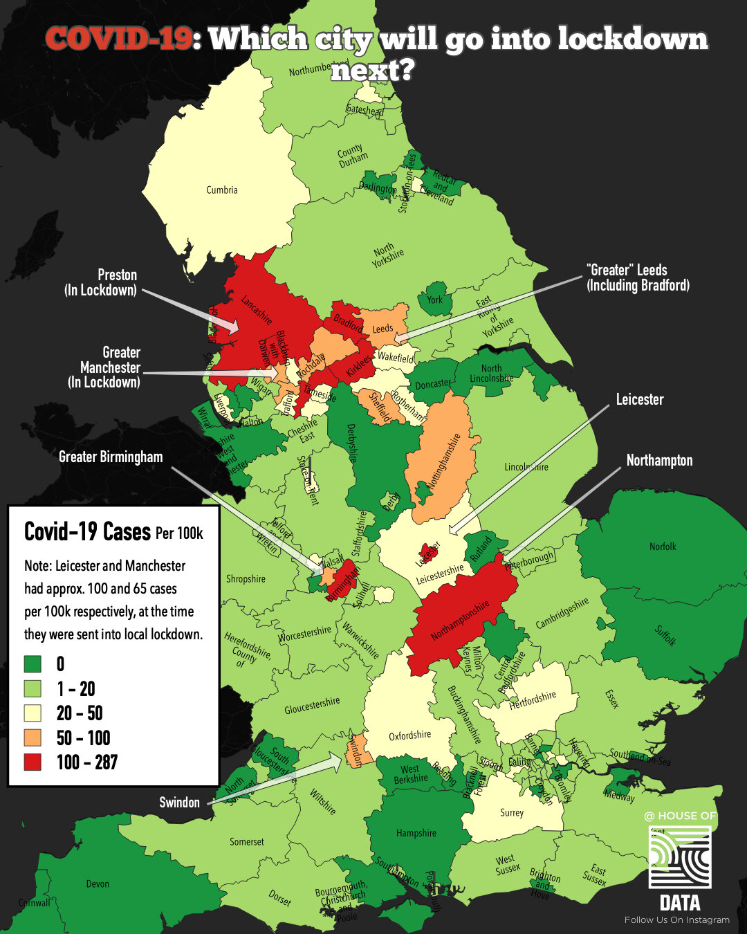
Which city will go into lockdown next? The map above shows the number of cases per 100,000 across England. Using the map you get a feel for which cities have the highest levels of Covid-19.
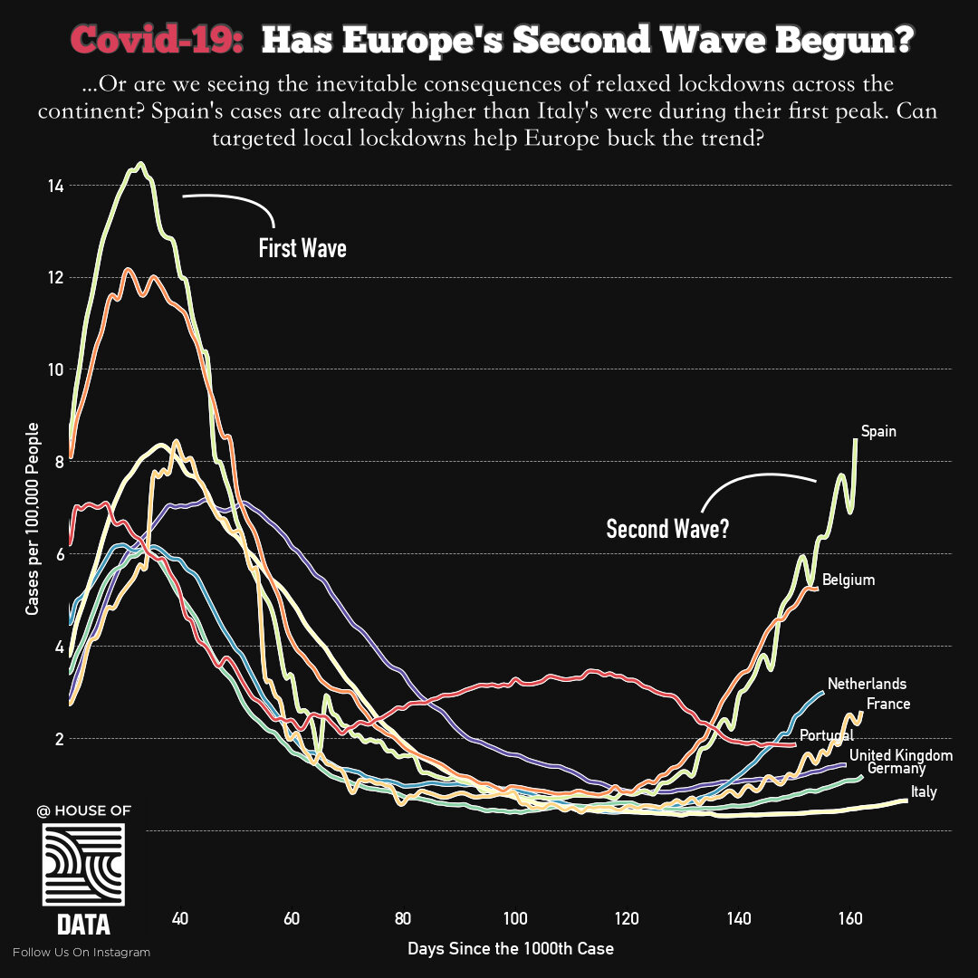
Has the second wave begun? It’s highly likely that relaxed lockdowns have created the opportunity for Covid-19 to spread faster in cities. But, we would have expected that governments were aware this would happen and had contingency measures in place to curtail any outbreaks as and when they happened.
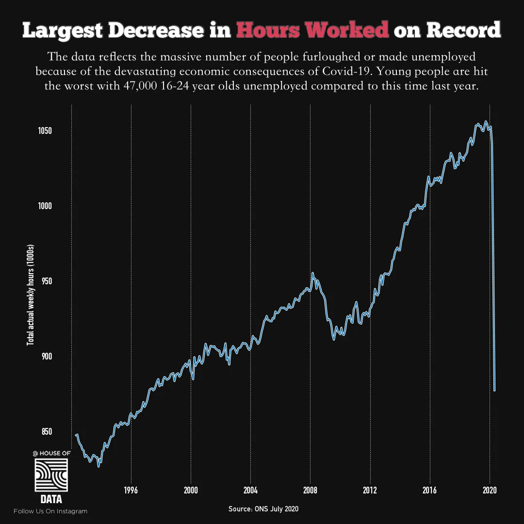
Today the Office of National Statistics released their update on the UK Labour Market. Given what is going on, the numbers above are not that surprising, yet it still looks insane when you see the fall in hours visually. Young people have been the worst affected. The government also breaks this data down by region and I hope to dig into this a little more over the coming days.
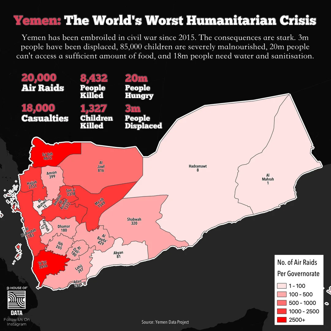
Yemen has been embroiled in civil war for nearly five years. The fighting - which is thought to be the outcome of a state-backed proxy war between Iran and Saudi Arabia has had severe consequences on the country. The numbers above speak for themselves.
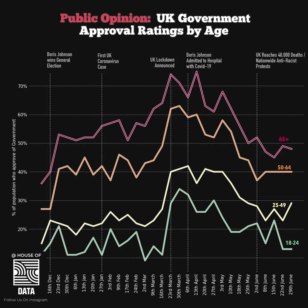
Approval rates by segmented by age. According to the data, the older you are, the more likely you will be to approve of Boris Johnson’s government. Similar trends were observed in data around the likelihood of voting for Brexit. Data sources: YouGov
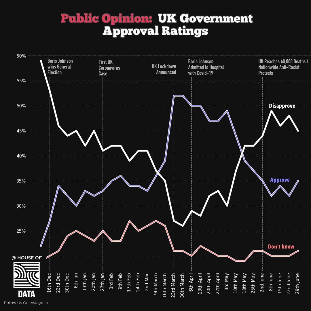
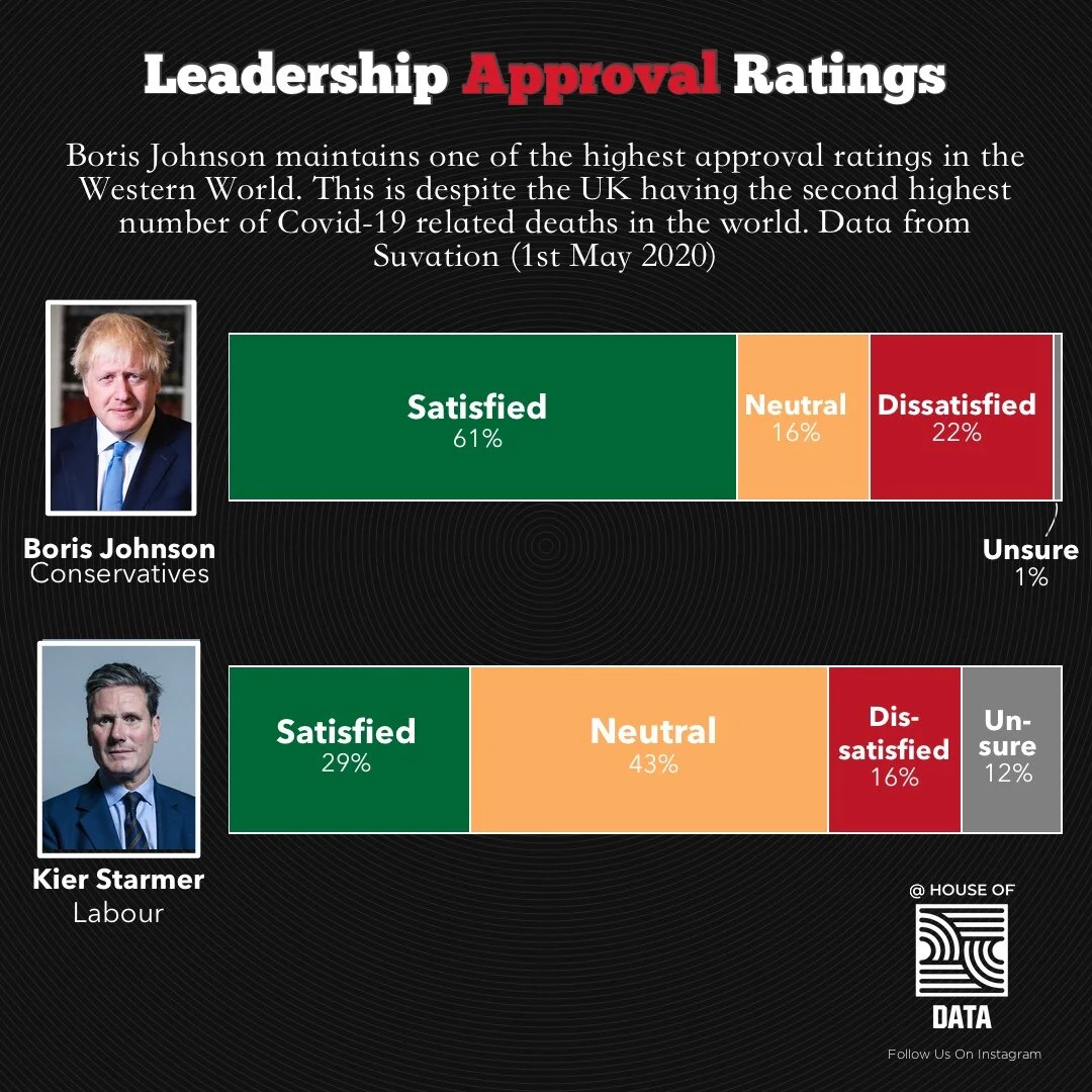
It looks like Covid-19 temporarily handed the British Government a temporary boost in approval. This has balanced out more recently as the UK passed the 40,000 deaths mark.
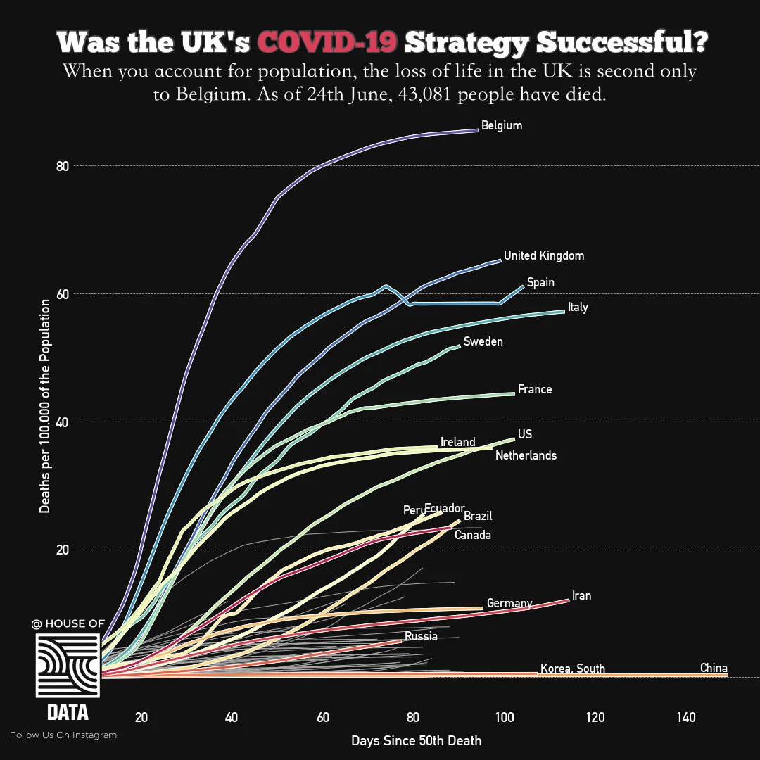
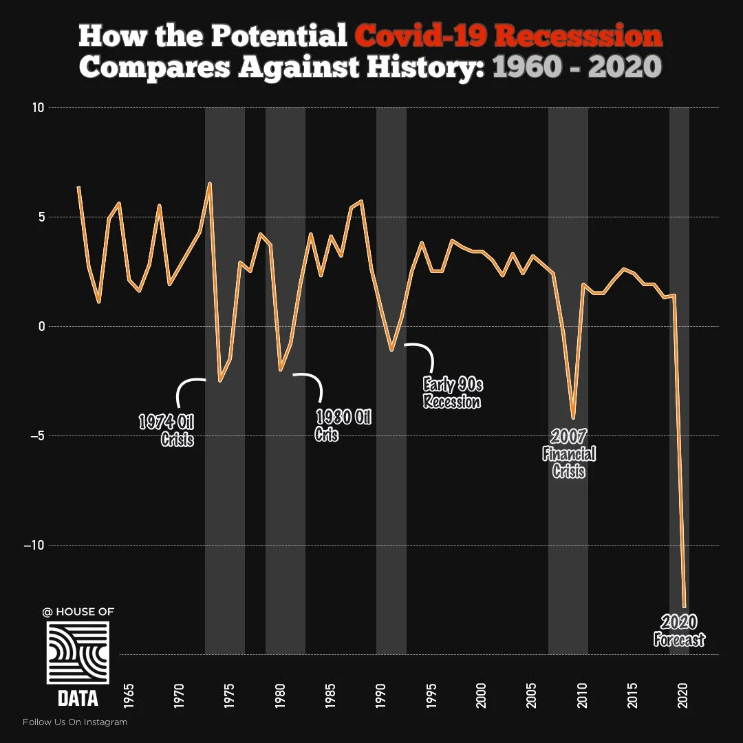
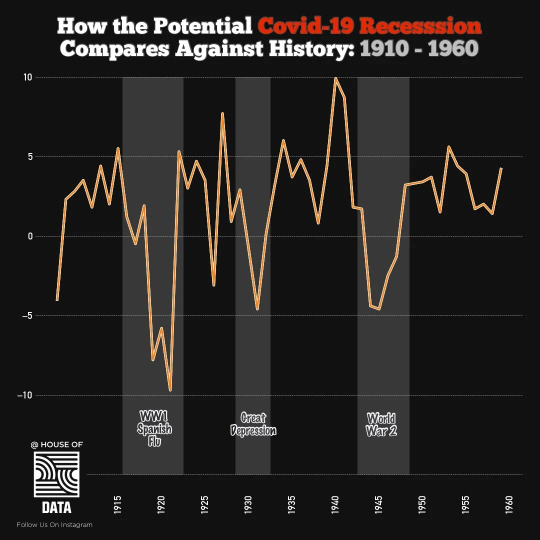
Back in April, a couple of weeks into Lockdown, Boris Johnson said, “there will be a time to debate the success of our strategy, but that time is not now”. Three months on seems like an appropriate time to gauge how successful the governments ever-changing strategy has been. Data sources: John Hopkins Coronavirus Institute
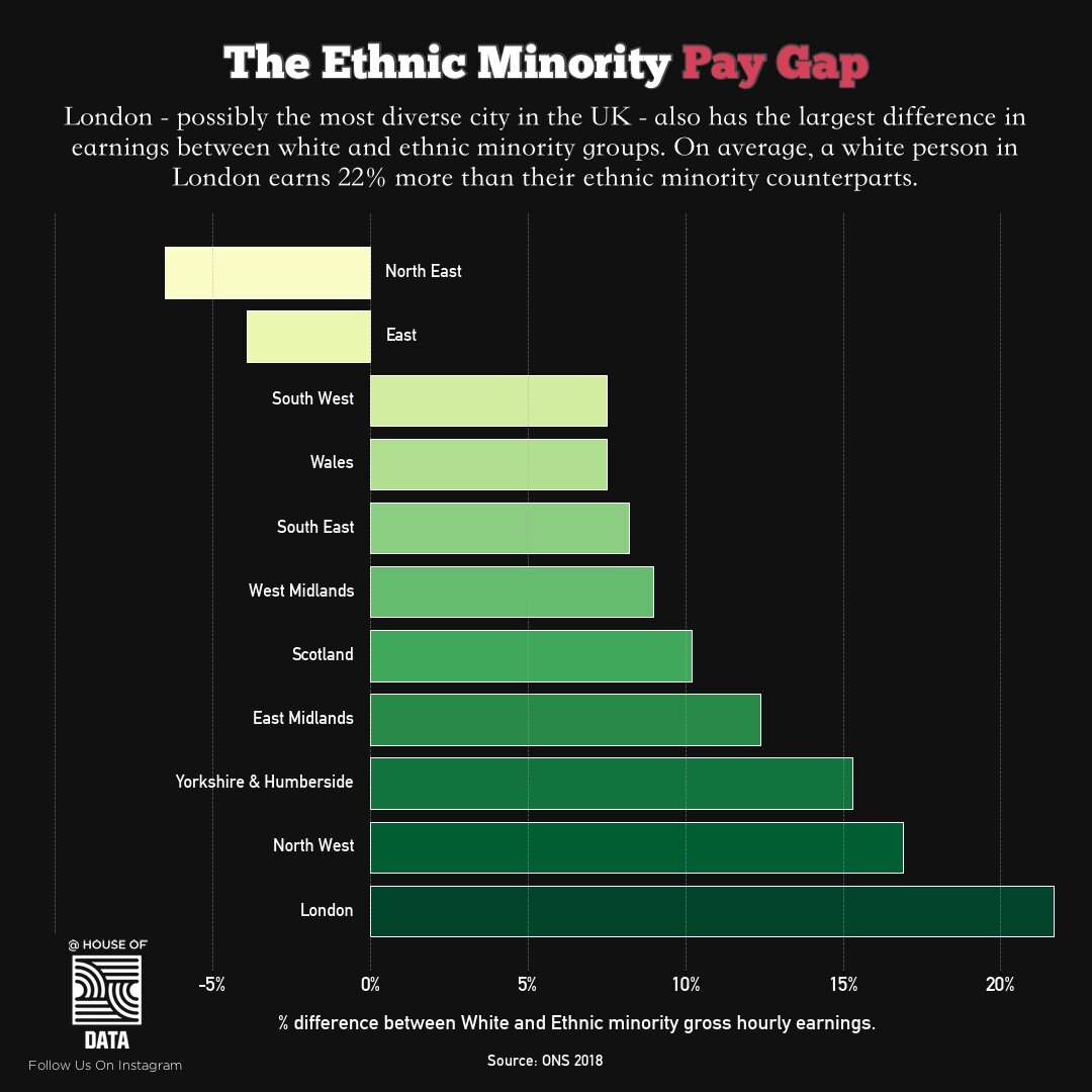
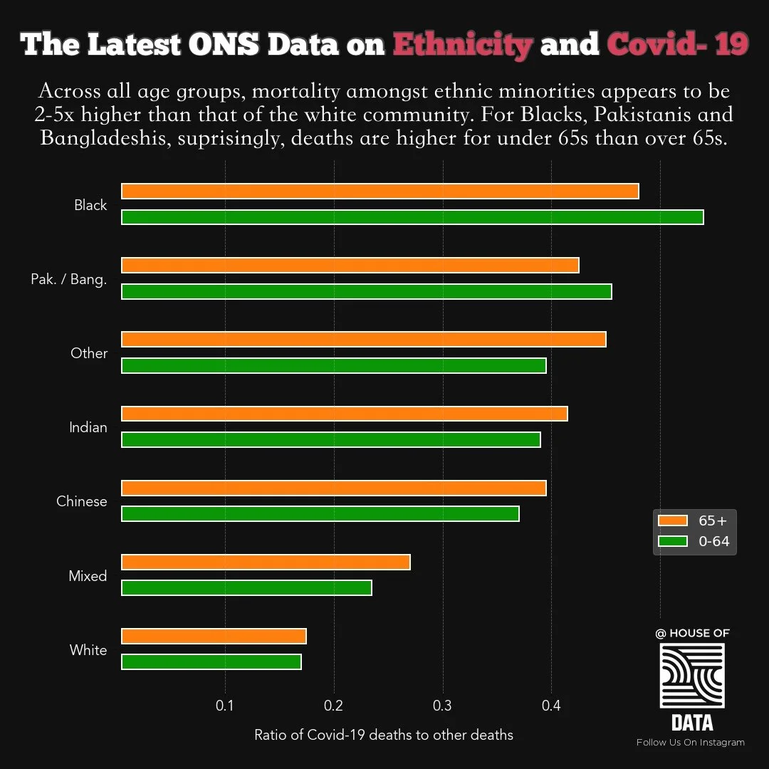
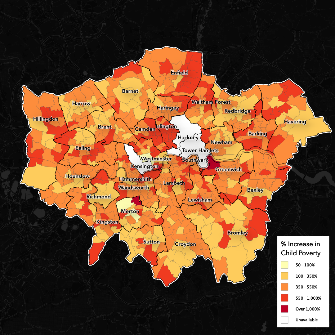
London is often praised as a true cosmopolitain progressive hub when compared to the rest of the country. It's interesting then that actually, the largest pay gap between white and minority groups is right here in London. On average, a white person will earn 22% more than an ethnic minority group.

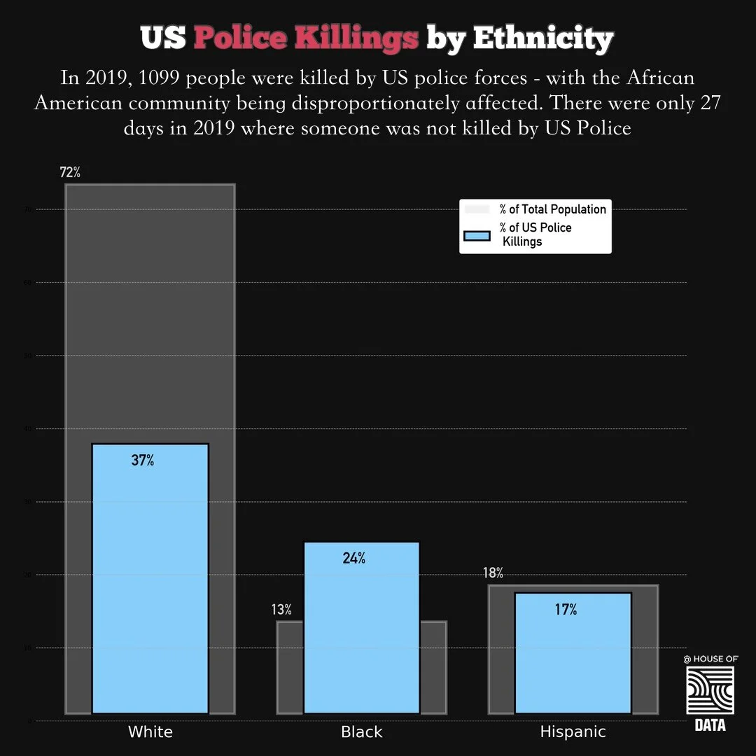
Black men and woman killed by US police forces since 2014. Of the names in this list, none attempted to attack the police. None were fleeing. In 72% of occasions, Police body cameras were either turned off or unavailable. 58% had known symptoms of mental illness. 64% were unarmed (remembering that being in possession of weapons is a ‘sacred right’ in the USA).
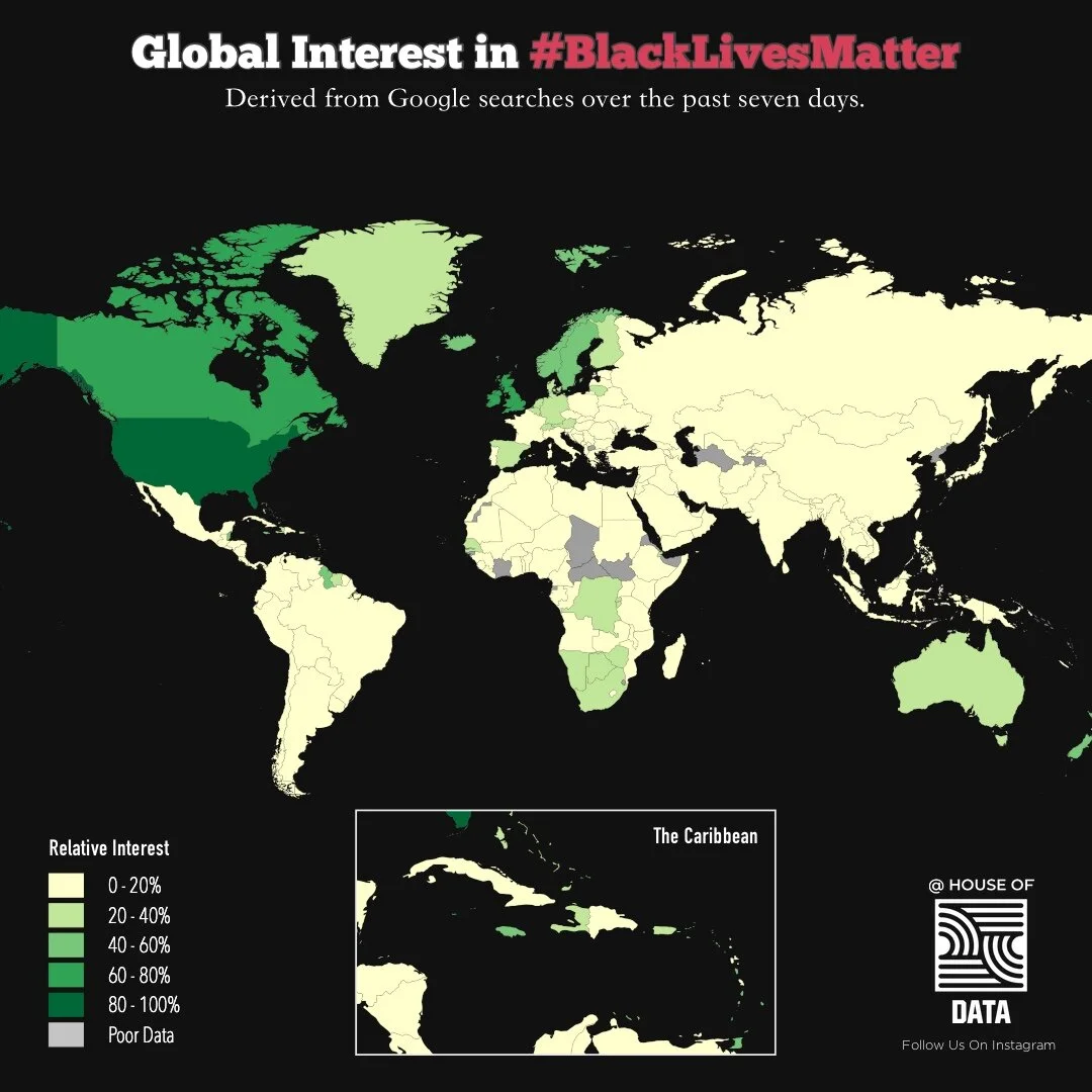
The map above uses Google Searches to gauge global levels of interest in the ‘Black Lives Matter’ movement. The map covers the period over the past seven days which has seen protests in the USA and beyond.